The Best Signup Page UX Design Tips For The Web
This page may contain links from our sponsors. Here’s how we make money.
Increasing signups on your site is not a straightforward task. You can tinker with form fields, adjust copy, and offer giveaways that can all show varying results.
But the best way to improve signups is through a quality signup page. If you can build an experience that people enjoy then you can run split tests to determine which designs convert best.
The toughest part is crafting an initial signup page that actually works! In this guide I’ll share the best tips you can use to design sign up pages that encourage interactivity and get users excited to join your site.
Keep Fields To A Minimum
If you follow any advice it should be this right here. Make sure your signup forms are accessible and easy to complete. The simplest way to do this is to reduce forms down to the absolute minimum.
When you have a larger site like Facebook or Twitter you can ask for more from new signups. People are less likely to bounce away from Facebook because they already know the site and know they want to join.
But your new social community site or forum probably doesn’t have the same brand recognition as Facebook. So you’ll want to encourage people to follow through and make those signups count.
The best place to start is by listing all the vital information you need. It may look like this:
- Username
- Password
- Email address
If you can get by with those 3 pieces then don’t add anything else. Fewer form fields increase the likeliness that users will push through and complete the signup.
Plus you can always add optional fields into their profile to be filled out later. Once you have their email it’s easy to send notifications right to their inbox encouraging updated profile fields.
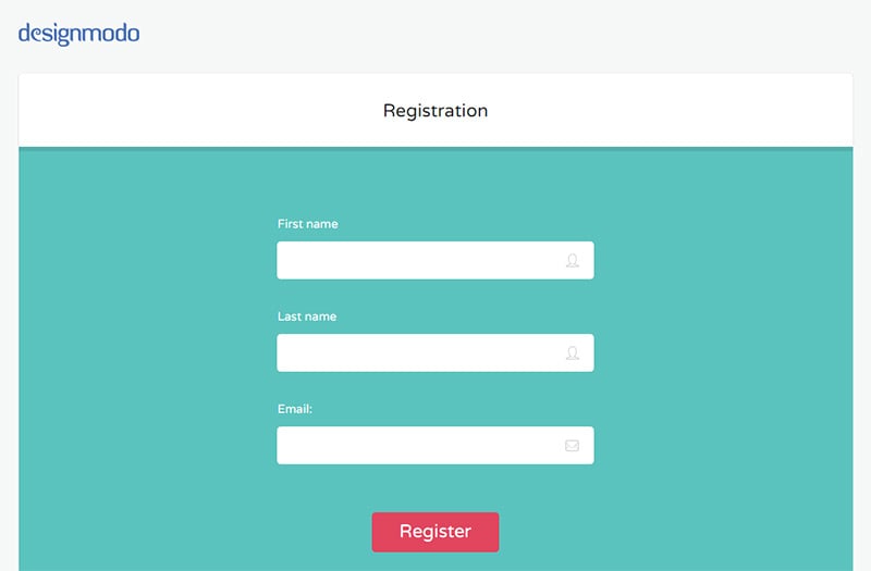
The Designmodo signup page is an excellent example of simplicity in action. It only asks for your first/last name and email address. From there you have options to customize other features, change your password, and other things a user might do.
But generally speaking those things aren’t as important as capturing the user right away.
Some websites go a step further and reduce signup fields to the lowest barrier possible. The modal window signup form on Asana only asks for one thing: an email address.
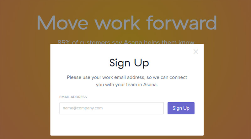
There is one tricky part of reducing down to 1 field. When you place lower expectations on signups you’re likely to gather poor-quality users.
I think it’s best to keep signup fields around 2-3 form fields, maybe 4 max. But there is no correct number.
Just reduce fields to the lowest you can go while still gathering the vital information you need for each new user.
Use Large Inputs
Energy goes where attention flows and users are much more likely to expend energy if your form fields dominate the page.
Try to design custom signup pages with very large text and inputs. Users will take notice and it’ll draw their attention right away.
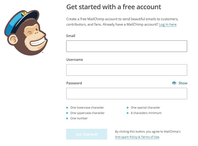
MailChimp is a prominent example of the username, PW, and email combo. Each field takes up a good amount of space and there’s nothing else to really focus on. You basically have to go through the signup or find a way off the page.
Other little extras like the password rating meter help to encourage signups. As you type your password the requirements fade as they’re completed. This subconsciously helps users complete their password knowing it’ll be accepted once all the requirements are grayed out.
You can bet MailChimp’s form has been A/B tested to no end so it’s bound to be a high-converting page. But every site is different and the audience will also be different.
The Shopify signup page is very similar in design, but uses slightly different written copy.
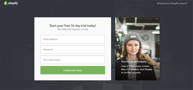
Instead of telling the user to register it offers a 14-day free trial. The signp field isn’t telling the user to sign up for a Shopify account, even though technically that is what’s happening.
But little differences in written copy can make a big difference in the long run.
If you’re ever unsure of how the page should look then just keep it simple. Big text, big fields, clear contrast and an obvious “submit” button always works well.
Study User Behaviors
The goal of A/B testing is to gather feedback from real users. You want to know which pages encourage behaviors you want—in this case increased signups.
So you might try changing the sign up button or adding extra text to the form. Or you might try increasing the text size or adding a different picture onto the page.
There are so many things you can test but this usually costs money. A better strategy is to read through conversion rate case studies to see what has worked for others. Look for strategies that you could implement in your own forms.
One idea is adding icons into your form fields like Pipedrive.
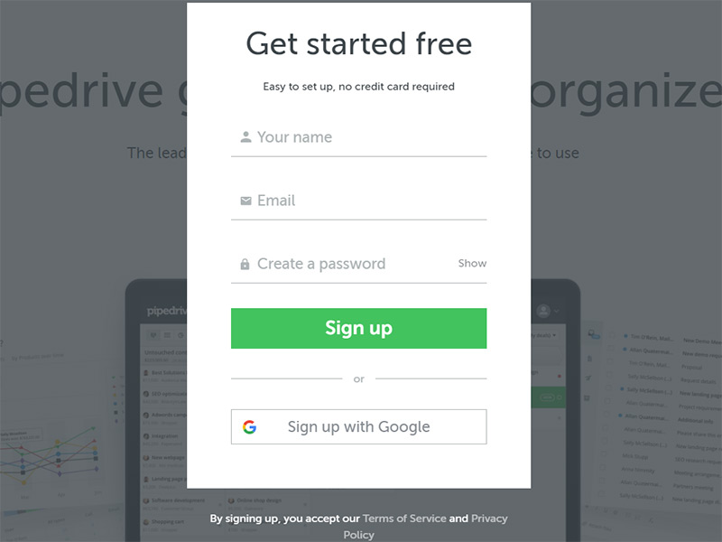
There’s no guarantee that this can increase signups, but it clarifies each field’s intent. And clarity leads to ease of use and a quicker end result.
Another good idea is to eliminate form placeholder text and use a label instead. This may not apply to every form, but this NNGroup study points towards placeholder text being fairly annoying and straining on the eyes.
By combining many ideas together you can design pages with large fields, strong signup CTAs, and design aesthetics that encourage action.
A big part of UX design is understanding behavior. When it comes to signup forms you’re looking for one specific behavior: sign ups!
This means you should study every case study you can find about user conversions. Try to understand what those websites did and how those changes increased signups.
These posts can get you started on conversion rates as they apply to signup pages.
- 14 Steps to Building Sign-up Forms That Convert
- 10 Research Based Tips to Improve Contact Form Conversions
- 8 Sign Up Form Examples For Easy & Breezy Conversions
Design Forms With Focus
I mentioned earlier how larger forms take up more space on the page. This usually leads to a secondary effect that’s also beneficial: keeping focus on the form.
It’s a good idea to strip everything else from the signup page other than necessary elements. Consider the Vimeo signup form and all its simplicity.
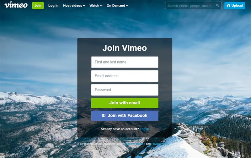
It takes full center on the page and it only uses one column. This way the user can move down the form quickly without any distractions.
But columns aren’t always a bad thing. If you can keep attention on the signup process then multi-column forms can work well.
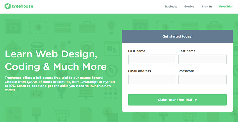
Take the Treehouse homepage as an example. It uses two columns for a total of 4 signup fields.
This does feel like a lot but the two column split gives the illusion that this field is smaller.
Do whatever you can to increase focus and keep attention on the signup form. You want to use colors, text, and a minimalist design style to encourage users to take action.
You can also try adding form plugins to your site for extra functionality.
But the key differentiator is a form with purpose. Tell users what they’re doing and why they should sign up. If you can design a great looking form with encouraging written copy then you’ll no doubt see an increase in signups.
Moving Forward
Now that you know how to craft signup forms you may be wondering about the next step.
I recommend making a list of what your signup page really needs. Can you get away with 2 fields? Then do that. Try a few designs and feel out the ones that seem the most encouraging.
Once you can get something online let it run and be willing to experiment. Design is a lifelong attempt towards improvement and optimization, but the only way to get there is to take the first step.