Call-To-Action Buttons: Top Performing CTA Design Trends
This page may contain links from our sponsors. Here’s how we make money.
Websites are built for a purpose. This usually revolves around user behaviors like reading articles, signing up to a newsletter, or getting more people to create user accounts.
The best way to encourage user behavior is with a Call To Action, or CTA button. This is extremely common on single page designs and landing pages where the user is meant to perform a specific action(eg. sign up for a trial).
Let’s delve into CTA buttons and check out some of the best design techniques you can use to increase performance and drive more conversions.
High Contrast Designs
Before the user can do anything you need to get their attention first. This can be done using graphics, big text, and high contrast colors.
Contrasting colors shouldn’t clash or ruin the experience. You’ll need to find that line between complementary contrasting colors and horrible color combos.
Take for example the homepage CTA on WordStream. This button uses a bright orange background that surprisingly blends well alongside the various shades of blue.

All this orange pops off the page and definitely grabs your attention. But it doesn’t feel so loud that it’s jarring or annoying.
At the very least this color grabs your eyes for a quick look before you move to other parts of the page. It’s a brilliant example of high contrast paired with a CTA button.

The Snappa homepage offers another fantastic example. Color selection is huge and it’s something you should spend a lot of time testing.
Instead of pairing colors by yourself you can try a color selection tool like Paletton. This is perfect for mixing up quick color ideas in a flash.
And if you’d like to demo some buttons you can use a tool like Button Optimizer to preview styles in real time right in your browser.

But the best place to find inspiration is in the wild studying real landing pages and cloning the styles you like most.
Front and Center
If you only have one preferred action for visitors then you should reserve space for your CTA on the homepage. Let your CTA take center stage and grab the most amount of attention.
You can even design graphics around the button to help drive attention towards that action. One nice example is the homepage of ResumeBaking.
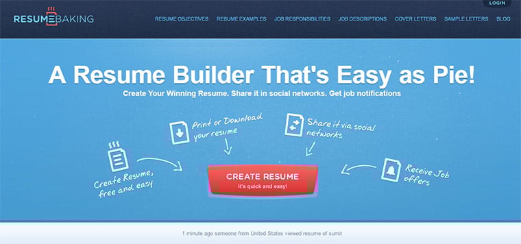
After landing on this page it should be immediately obvious what this site offers(a resume builder). The red CTA is very large and placed prominently right in the visitor’s line of sight.
Various icons all point towards this CTA making it even more recognizable. This is by far one of the strongest call-to-action designs I’ve seen. The colors and graphics all work well together and the written copy is fantastic.
By placing this button right in the center of the header it becomes the focal point of the page. This is exactly the effect you should be going for.
The PickWish website has a similar style with their centered email opt-in form. This uses a much smaller CTA button, however the entire form is really the call to action.

The site’s goal is to increase signups by keeping that form visible right at the top of the page.
It immediately draws attention and lets the visitor know that they can actually sign up for an account. Assuming this is the primary goal I’d say it’s a very well-organized homepage.
Multi-Option CTAs
Many websites don’t have just one flow for the user to follow. They might have a few pages that target different things for different users.
I’m not sure if this has an “official” name but I call these designs multi-option CTAs.
Basically you include different CTA buttons all near the top of the screen. Then the user decides which CTA, if any, best suits their needs and seems worth investigating.
The Wishpond homepage is an excellent example of this effect.

Notice how one button uses a bright orange background while the other has a ghost button effect. These two combine and work well together because of the contrast.
But they also draw attention through asymmetry. It lets the visitor know that these two buttons each do different things. Or you could have two options that perform similar actions like Teampaper Snap.

Notice these two buttons both let you download the app. However one brings you to the App Store for download, the other lets you download the .dmg file directly.
Both actions are different yet closely related. A bit of stylistic coloring and you’ve got one heck of a header.
Most of the time when I see these CTAs they offer two completely different avenues for visitors. On Babylist you’ll find two buttons: one to create a baby list, another to find a registry.

This is a great strategy because it targets two major groups of people who would visit this website. It’s definitely something you should consider with your CTAs to make sure they’re relevant to all visitors.
Contextual Design Accents
There’s plenty of UX benefits to adding icons into your UI. These small graphics leave a recognizable visual for users to connect with.
Common icons like the hamburger menu have made their way into modern interface design. People are slowly learning what certain icons mean so as they permeate into the culture it’s easier to design interfaces around them.

On the Newton homepage you’ll find a clear CTA with a downward-facing arrow point towards a flat line. This icon is synonymous with downloading files, so most visitors associate that button with a file download.
It actually brings you to the App Store page for the program, but this has the same effect.
Think about the context of your CTAs and how you can use graphics to clarify intent. If you can find an icon set that blends nicely with your page you’ll often see very positive results.
Glyph only uses Twitter OAuth connect for user accounts. Their CTA includes a small twitter bird icon with an arrow pointing forward.
This informs the user of what happens when they click the button. It links directly to the Twitter authentication page to allow the app to connect into Twitter.
Clarify your CTAs with icons that add context and telegraph the intent of the button. It makes communication so much easier with little extra work required.
Moving Forward
Well-designed CTAs are a cornerstone of high conversion rates. You can do a lot of testing with different styles to see what works best for your audience.
You should also spend time practicing copywriting to learn the best CTA copy techniques. Your goal is to increase clicks and conversions with every CTA you design. Merging these design tips with incredible copywriting is a recipe for success.