25 Company Websites: Showcase of Business and Corporate Sites
This page may contain links from our sponsors. Here’s how we make money.
A company's website is its digital storefront. It's the first thing potential customers see, and it needs to make a good impression. No matter what kind of product you sell or service you offer, it's imperative that your company website looks great, is easy to navigate, and reflects your brand.
In this article, we'll take a look at a number of company websites from around the web. We'll discuss just what makes them great and point out some design and user interface elements that you can easily use for your own website.
Showcase of Company Websites
Whether you're a web designer working on your next project or you're looking for some inspiration for your own corporate website, take a look at this showcase of 25 examples. They run the gamut from sleek and minimalist to fun and playful, but all of them leave a lasting impression. Some of them dazzled us with their design, while others impressed us with their interface. We're sure they'll inspire you, too.
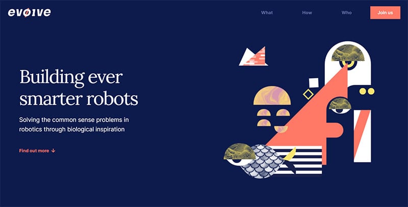
Evolve
Evolve to Binary is a group of scientists and engineers working to create AI robots to improve the world. Their company website is built with Webflow, which is a simple to use web builder that lets you easily design a site that flows as a single, scrolling page. This type of site is extremely trendy right now, and it's a good option for tech-based companies. Of course, any site you design should be responsive to be viewed on mobile or desktop.
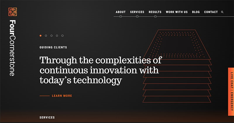
Four Cornerstone
IT services firm, Four Cornerstone has an innovative design for their website — doubling down on the message of continuous innovation they portray with their branding. If you play around with the navigation, you'll see the unique and interesting way you move both horizontally and vertically around the website. You'll also notice their use of the color orange, which symbolizes success and communication.
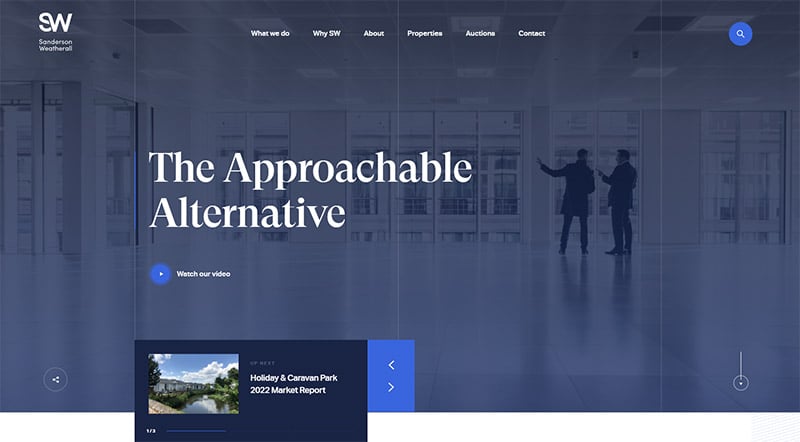
Sanderson Weatherall
Sanderson Weatherall's corporate website design features a large, monochromatic image in the background with their company slogan in bold type. It's a simple, yet very effective design. As you scroll, beyond the services, testimonials, and company news, you'll notice the navigation bar becomes “sticky” at the top of the page. This is a basic, but often overlooked, detail in many sites today.
Signum
Signum Architecture's site makes use of high-quality photos to grab the website visitor's attention. Captivating images of their featured projects with classy hover animations come into view as you scroll down the page. They also use words and catchphrases scattered throughout to invoke emotions.

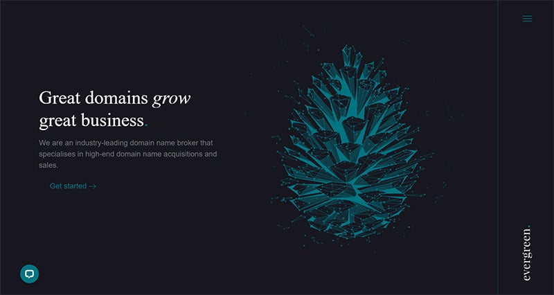
Evergreen
High-end domain name broker, Evergreen has a digital pine cone animation as the concept for their home page. The navy blue and teal green color scheme feels very luxurious and on-brand. Deep blue represents authority, and green is the color of money. As you navigate the site, the pine cone animation transitions into a bear, a hand holding a seedling, and a bird.
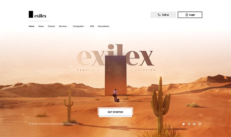
Exilex
Exilex is a website for a Canadian law firm. But this is no typical law firm — it's fully automated. So, it would make sense that their website wouldn't look like a typical law firm's site either! Instead, it has a more modern, techy vibe. The site has online booking, bios for team members, connects to mobile apps and maps, and has all the main social media links — more things you won't normally find on an attorney's website.
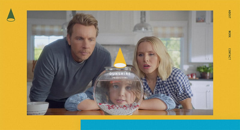
Dunshire Productions
Dunshire is the creative studio behind Parks and Rec and The Good Place. Their website could be in a showcase of audacious websites. It's bold, funny, somewhat ridiculous, and quite colorful. But it's exactly the professional image you'd expect from a studio that specializes in humor. Remember, your website needs to reflect your brand!
Statworx
Data science, machine learning, and artificial intelligence are what drive Statworx. As far as corporate websites go, the design of theirs is fairly simple, but with a few notable features. First, the option to view the site in either German or English. Next, the heavy use of black is symbolic of intelligence, according to color psychology.

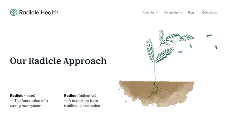
Radicle Health
Human services software company, Radicle Health has one of the more minimalist designs on our roundup. With a crisp green and white color palette, simple watercolor-style graphics, and an easy-to-use interface with clear headlines and large text, the website easily shows off the company's culture of integrity.
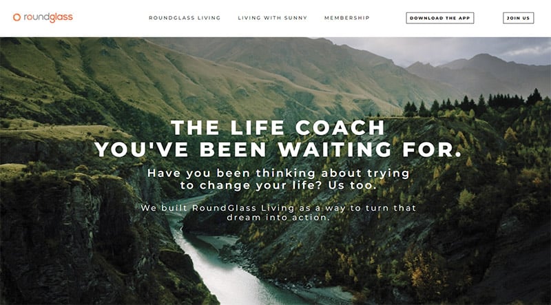
RoundGlass
This wellness membership site has beautiful, full-screen image headers that draw you into the site and all but force you to read the headlines! If you're viewing the site on your PC and it looks a bit too large, that's because it's really a mobile-optimized version. Look at it on your phone to get the full effect from all the beautiful header images.
Handel Architects
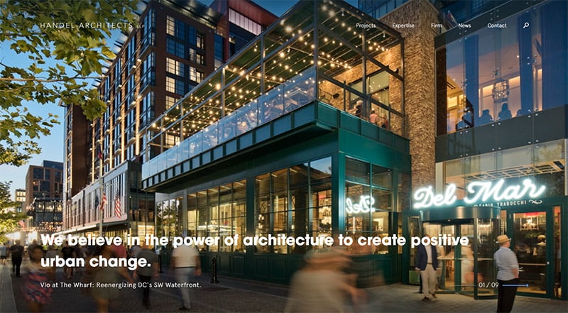
Handel Architects' corporate website makes use of some neat hover tricks. Scroll past their nice full-screen header image, notice the useful sticky navigation bar, and stop at the third panel that shows two drawings overlapping. You can mouse over each drawing to have it move to the front and appear in color. They repeat that hover on the next panel, too. Pretty cool!
Shift Paradigm
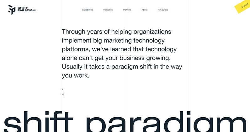
Shift Paradigm has some interesting animation on their website, as well as unique design elements that make their site not so “cookie cutter.” Small things like the yellow contact button in the right-hand corner or the unique color palette can make a huge difference in making your company website design stand out from the rest.
Hedron
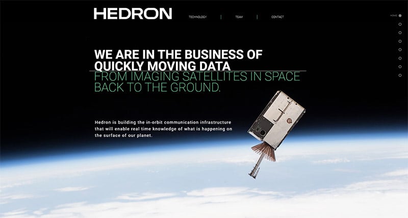
Hedron is building a network of satellites in space to quickly move data. The black design of their site portrays both intelligence and outer space. In fact, the site is almost primarily black, white, and gray other than an image of the earth in space and light green — a symbol of stability and growth. The site is designed as a single scrolling page, but you'll notice there is navigation in the form of dots along the right-hand side.
D'Marie Productions
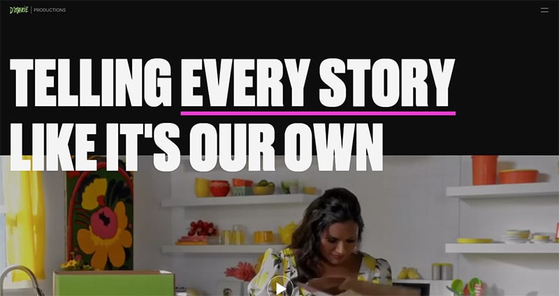
Here we have another production company. Similar to the one above, it's lighthearted and colorful, but not nearly as silly. Their past and potential clients are not all in the humor space, so they had to keep it somewhat serious. But, they still let the personality shine through. This is especially important for content creators.
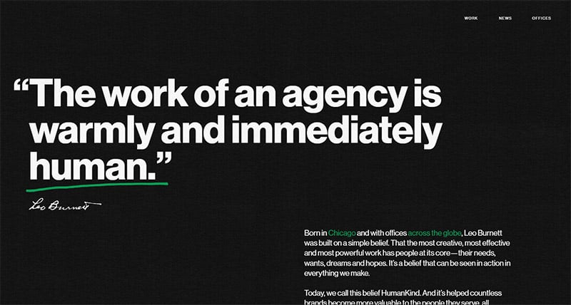
Leo Burnett Worldwide
Ad agency, Leo Burnett's beautiful design can be attributed to its simplicity. In this case, the black background is a perfect frame for the video clips of their work. High contrast white, large text with pops of kelly green, symbolizing the growth you'll achieve by hiring them. An inspired touch that adds to the user experience is that they changed the cursor to a green dot to match the website.
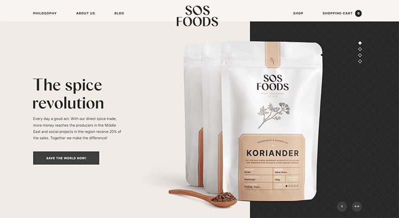
SOS Foods
SOS Foods' website design is proof that high-quality photos are imperative. It doesn't matter if you're in the agricultural industry, the construction industry, or if you're running an ad agency — as you can see, beautiful photos make all the difference.
Related: How to Hire a Product Photographer for Your Website
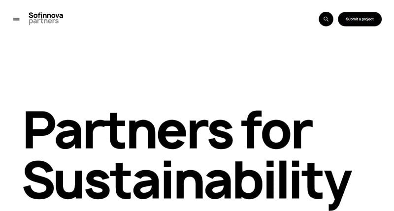
Sofinnova Partners
Websites like this one for Sofinnova Partners make for interesting digital experiences. As you scroll, you don't know what color or animation will greet you next. And while they are simple — they do have a company profile to adhere to — they certainly keep you scrolling. This type of design is quite effective.
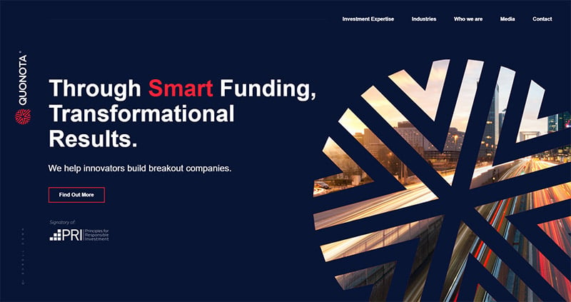
Quonota
Quonota, an investment firm, uses a unique repeating graphic of the letter Q on their website. As you scroll, you'll see the Q with a new colorful image inside. This gives the site a cohesive look from one page to the next. You'll also notice a little dot that chases the cursor around the page. Details like this make the user experience memorable.
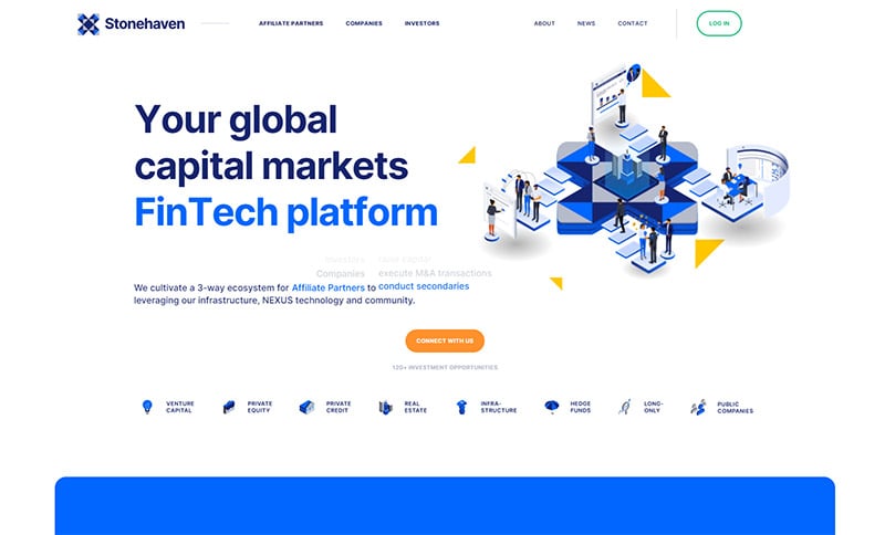
Stonehaven
Stonehaven's company website makes use of a variety of illustrations and animations to demonstrate what they do for their clients. The nearly all-blue color palette tells the world they are trustworthy and reliable. Blue is one of the most common colors in corporate website design for this reason.
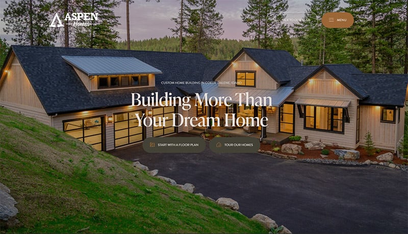
Aspen Homes
This example has the upscale look you'd expect from a high-end builder's company website. The natural color palette matches the style of the brand. The gorgeous, full-screen images and scrolling design make the site both easy to navigate and nice to look at.
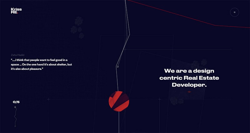
KrissRE
Real Estate developer, KrissRE has an extremely interesting and interactive website that you'll need to visit to truly understand. The custom cursor on the home page is a fun feature perfect for this site, but not for everyone. However, since the company is design-centric, it makes sense that their website is very design-focused, too.
Neoplants
Above the fold, in massive letters, you're met with the words, “The future of plants.” That's one way to make a statement! Scroll further and you'll see a video that explains Neoplants' mission. Satisfying and intriguing imagery and animation also make this a winning website design.

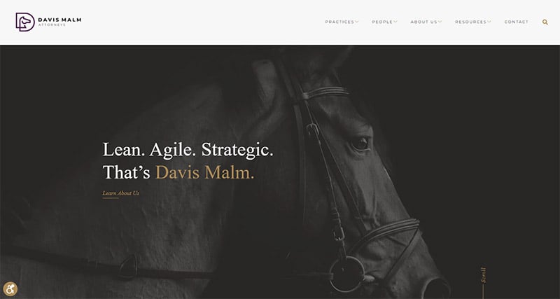
Davis Malm
If you're looking for something a bit more on the conservative side, here's one for you. Boston law practice, Davis Malm's corporate website is definitely a design worth taking a look at. A dark, gray-toned photo of a horse for the background header image is symbolic of their headline copy. The color scheme of purple and gold is rich and sophisticated. The site is crisp, clean, easy to navigate, structural, and effective.
Kea Consultants
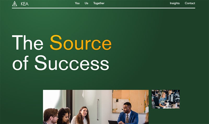
Sometimes, simply switching up the layout just a little bit will make your website stand out among all the rest. Such is the case with KEA Consultants. The design is simple, but they nudged the text over to the left so it's different than every other site we're used to looking at. A fresh layout makes you stop scrolling and pay attention.
The McBride Company
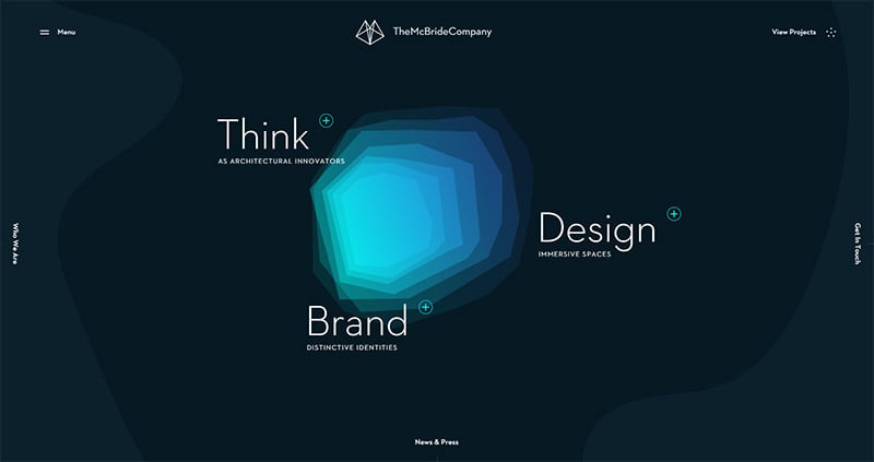
The McBride Company got really creative with the navigation on their company website. While there is a traditional menu you can access in the top left corner, you'll also find navigation on the left, bottom, and right-hand sides of the home page. They've also included a photo of Lucky the dog, the official “Office Greeter” on their Team Members page. I love that!
Final Thoughts on Company Websites
Whether you're a business owner building your company's first website or you're a web designer looking for inspiration to design a company's site, you'll find plenty of great examples here. While they are all very different from one another, these company websites are easy to navigate, professional-looking, and reflect their brands well. We're sure you were able to find some inspiration from a few of these examples that you can borrow for your own design!
