Tips For Designing A Stellar “About Us” Page
This page may contain links from our sponsors. Here’s how we make money.
The about page is a staple for every website. It lets visitors know a bit more about the brand, the people, and the purpose behind a website.
But there are many ways to approach an about page. And in this post I’ll share the most popular strategies(plus examples) to help you design these pages in greater detail.
Showcase Personal Photos
You should always try to add a personal touch onto your about pages whenever possible. Photos are the best means of connecting with visitors and this is especially true of personal photos.
Add pictures of yourself, your staff, or photos of your office. Include pictures of yourself hard at work. Use photos that help to sell and bring attention to what you do.
Websites are mostly digital so they can feel very disconnected from reality. Photos bring a human touch.
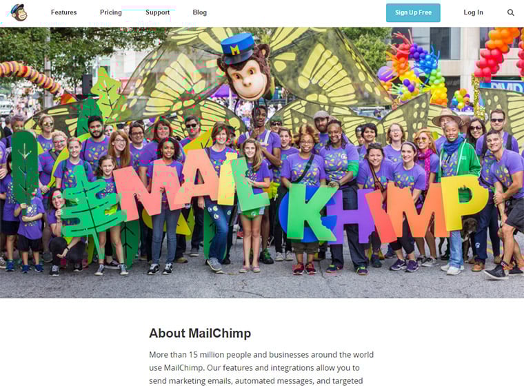
The MailChimp about page offers a brilliant example with the entire staff in a photo shoot. This photo sits right at the top of the screen and it’s meant to immediately grab your attention.
I love these full staff photos because they’re incredibly humane. You get to see how big a company is and the faces behind the company.
As you scroll a bit further you’ll also find photos of the staff members with bios and explanations of what they do. These photos show that MailChimp is more than just a monkey mascot. It’s a team of hardworking individuals that keep your newsletters running.
Corporate websites aren’t the only ones that can benefit. In fact, I’d argue that personal sites benefit even more from personal photos. Jeniffer Drake has a cool about page with a photo header section.

Since this website is all about Jeniffer it makes sense to include some photos of her near the top of the page. But not everyone has money to pay for a photoshoot, and you won't really need professional photos anyway.
Add whatever photos you can and try to keep them natural.
If you want to look professional or buttoned up you can do that. If you’d rather let your hair down and have some fun that’s great. No rules!
Personal sites are much more about expressing yourself, so don’t be afraid to do that on your about page. It’s probably the best page to do it.
Timelines & Backstories
When people click an “about us” link they’re usually expecting a certain type of content.
They want the story behind the company(or person). They want to learn all about the website. When was it started? Who runs it? What does it do, why does it exist and why should anyone care?
One of my favorite examples is the about page of Nick Reese, a consultant and expert marketer.

Notice the very top of the page uses a personal photo to grab attention. This really humanizes the page and shows that this is about the man Nick Reese.
As you read further you’ll learn about Nick’s journey through many projects over the years. He includes a brief bio, some history on his work ethic, his current skillset & a timeline of the projects he’s created.
The entire page is very well-organized and the written copy is exquisite. You’ll be reading from top to bottom enticed the whole way through.
If you’re willing to delve into this much detail I absolutely recommend doing so. Let the world know who you are and the people interested will read it all.
This can also work for company pages and Moz has an interesting strategy.

Their bio section is pretty small, but the timeline is huge and covers everything about the company. It’s a fun way to follow the Moz brand all the way into current times.
Not everyone feels comfortable sharing much about themselves(or their company). You’ll need to decide where your limit lies and how much you’d be okay to share with people.
But try to share at least something just to add a personal touch.
Promote Yourself & Your Work
Websites aren’t kept online for fun(usually). Websites typically spotlight a business, service, product, or something valuable which justifies its existence.
The about page can be used to promote this purpose & draw visitors further into the site.
You can do this with visuals, photos, videos or compelling copywriting. Yes it’s also
good to expand upon the people behind the site. But don’t be afraid of a little self-promotion!
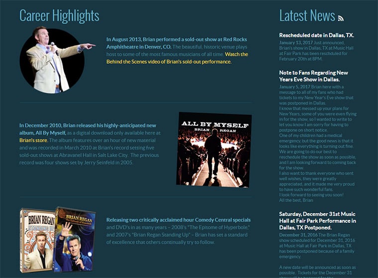
The comedian Brian Regan has a small about page with details about his stand up career. This is certainly a way to learn more about Brian’s work, but it’s also a way to dig deeper into his material.
By promoting his stand up he has a better chance of connecting with new fans. And this doesn’t always require a product for sale.
The about page for comedian Matt Donaher explains his bio and history, but also shares links to his performances online. Many comedians put out videos and this is a great way to draw attention.
You’ll even find promotions on “about us” pages for free resources like FreeBSD. The purpose of the website is to sell/promote something, so your about page can certainly do this without feeling too sales-y.
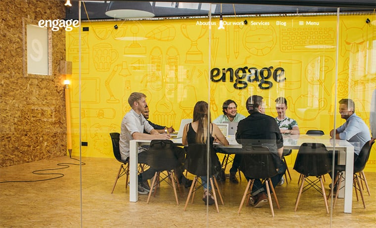
Engage is another example focusing more on the corporate side. They use photography to help sell and it does an excellent job.
But they also list the services they provide with links for more reading. This sells what they do while also selling the company and the people simultaneously.
It’s not easy to promote yourself but it’s a necessity to get your name out there. Find other examples you like and rework your site to follow in their footsteps.
Cover The Big Picture
Each idea I’ve covered in this post should come together into one big “about us” compilation page. This means you should really plan the page in full before even designing the layout.
I recommend wireframing and pre-planning with design resources to nail down a look for your about page. From there you’ll know what type of content to fill out and how users will consume that content.
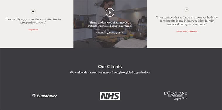
The Shape page is an excellent example of this gestalt principle in action. You’ll find team photos, a brief bio, an intro video, and logos from all their best clients.
A great about page should answer the question “WTF is this site?”
And you want to answer that question as fast as possible. By designing for the big picture you’ll learn what visitors want to learn and how you can deliver that information quickly.
One other example I like is the about page for Charles Ngo.
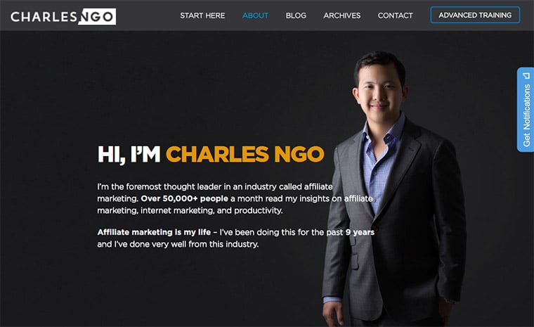
It’s dark, clean, and simple. Usability should always be at the forefront of your design.
Charles goes into detail about his history, how he learned, and how he rapidly grew his skillset in marketing. This leads into tips for beginners and promotes a few of his products.
You always want to keep one eye on the big picture and another on the smaller details. This often leads to the best about page that covers pretty much everything.
Wrapping Up
There is no single correct way to design an about page. Instead there are many different techniques and you’ll need to decide which ones fit best with your goals.
I certainly hope this article can help you plan your about pages with clarity and purpose. And if you have any other tips/ideas feel free to share in the post comments below.