Style Guides For Web Projects: Tips & Guidelines
This page may contain links from our sponsors. Here’s how we make money.
Large design projects require style guides for branding, identity, and consistency in writing. But these large projects also deserve style guides for their websites too.
A website style guide cover page elements that should be universal to a design. Consider things like buttons, page sections, typography, forms, and other related styles. With a web style guide these features are in one place to help other designers match the project’s style.
In this post I’ll share tips for creating a usable web style guide that highlights all the stuff that helps designers the most. If you follow these guidelines you’re sure to create style guides that work well and cover all the important design features.
Write Clear Statements
Each page in the guide should be concise and to the point. Style guides should not be lengthy technical documents.
They’re created as visual guidelines for designers & project managers, so the style guide’s layout should reflect that.
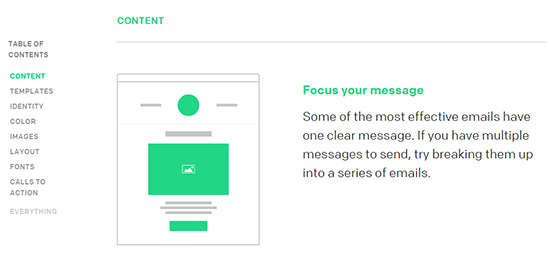
Take a peek at MailChimp’s Email Design Guide. It’s easy to read as one vertical column streaming down the page.
It also uses a clear table of contents for organizing the guide into sections. You can skip ahead to guidelines for images, fonts, layouts, or anything else.
Notice how each section is concise and to the point. These style guides are not meant to be essays or philosophical debates. Designers just want to gather required information in the fewest amount of words.
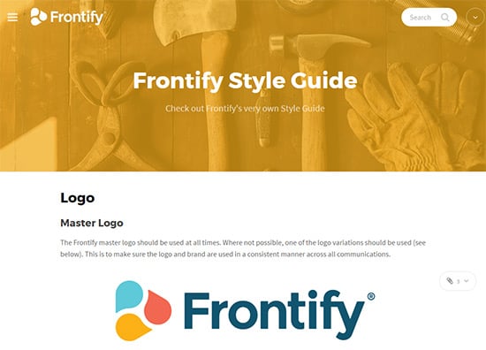
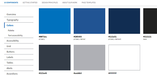
The Frontify brand guide is another fantastic example of a style guide on the web. It does have sections for site identity but this style guide is mostly for the website’s design features.
You can browse through webfonts, colors, spacing, and each of these sections has internal links for sub-sections of the page.
And notice how the colors page is crystal clear. The colors are neatly organized with color codes for HEX, RGB, CMYK, and PMS. You can even download digital color swatches directly as .ASE files.
Clarity isn’t something you look for. It should be apparent from the very first pageload.
Design your web style guides with clear intent and remove all excess content. Focus primarily on visuals and use writing to explain how these visuals should be implemented.
These are some other well-organized style guides you can look into:
- CodePen
- Mozilla
- Lonely Planet
Organize Guides By Topic
Think of a website’s style guide much like an online brand book. When you open the first page you should see a list of chapters and sections to browse.
You can add sections with a table of contents and make it easy for anyone to skip around. But you’ll also have to consider what to cover and how to split up the guide.
All style guides focus on style but websites should have certain sections in their guides:
- Typography
- Colors/textures
- Iconography
- Layout & containers
- Buttons
- Forms
- Animation
That last point is really important because UX animation is a hot topic in today’s digital ecosystem. Animation expert Val Head covered this in her blog stating unequivocally that animation “absolutely belongs in your style guides”.
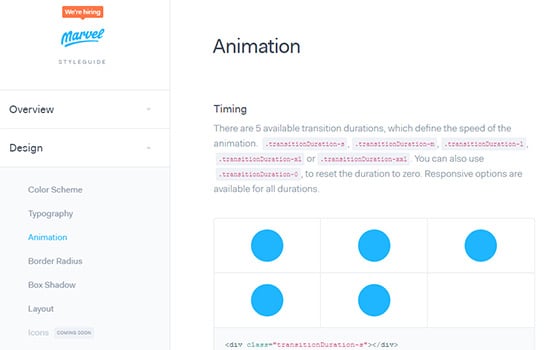
The above example from Marvel points to their animation guide. It’s a chapter nestled deep in their web style guide and it covers very specific guidelines for timing & easing.
These animations can be applied to anything. Dropdown menus, animated buttons, slideshows, pretty much any element on the page that moves.
If your web project uses animation then it should have a consistent theme. The same ideas apply to web typography, buttons, and form inputs.
But how you structure the guide does matter. It’s the difference between a usable style guide and a jumbled mess of suggestions for designers.
Take a look at Yelp's style guide.
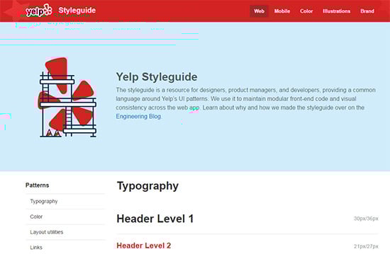
They’re an Internet company so their style guide is only made for the web. It covers features called “patterns” which get the most attention in the floating sidebar.
Also notice how their style guide is just one long page. You can keep scrolling and hitting different sections as you go. Navigation menus, page containers, buttons, and even custom objects all have their own sections.
Different style guides place varying degrees of importance on different elements. You’ll have to make the call deciding which elements deserve the most attention in your guide.
And just for good measure I’d like to share one not-so-organized example. The Code For America style guide uses a hidden menu that you need to click to open. But the menu only loads different pages, not different parts of the guide.
So their style guide is literally one long stream of content with no glossary, table of contents, or any sort of useful browsing tool.
Do not just plop everything onto one page and call it a day. It’s the worst way to “organize” anything, especially a complex style guide.
Without picking on CFA I just want to use their example as what not to do in your own work. It’s also a good example of why organization really does make a difference.
Use Visuals To Share Ideas
Web style guides are visual in nature. They’re made for other designers to clone styles and common page elements. This means visual examples help a lot more than words.
Add plenty of visuals to every section of the guide. These visuals should serve to demonstrate examples of whatever you’re covering whether it’s headers, image captions, or form inputs.
My favorite example is the US Web Design Standards style guide. It’s one of the few things that bureaucracy didn’t ruin because it needs to be accessible to everyone.
Each section includes plenty of visuals with optional code snippets. The alerts page is a pristine example of this.
And the side navigation stays fixed all the way on every page so you constantly have access to the navigation.
Buffer does something very similar in their style guide which is a bit smaller. But their visuals help to sell each element by showing how it can be used in a real-world scenario.
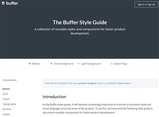
Try to think practically when designing your style guides. People reading these guides want to implement real solutions and it helps to have something to study.
Buffer’s style guide includes examples with live embedded elements on the page. These all include the CSS class and the type of feature whether it’s a blockquote or a social sharing button.
And while we’re learning from examples I’ll drop this link to Drupal’s style guide. It uses almost no visual examples and the ones they do have are very limited.

As you can tell it’s tough getting any real value from this guide. Not to say Drupal has poor taste in design or that their guide isn’t valuable.
However the organization is poor and the lack of visuals really ruins comprehension.
Web style guides are made for visuals on the web. So use plenty of these visuals when you’re actually creating the guide.
Add Writing & Tone Guidelines
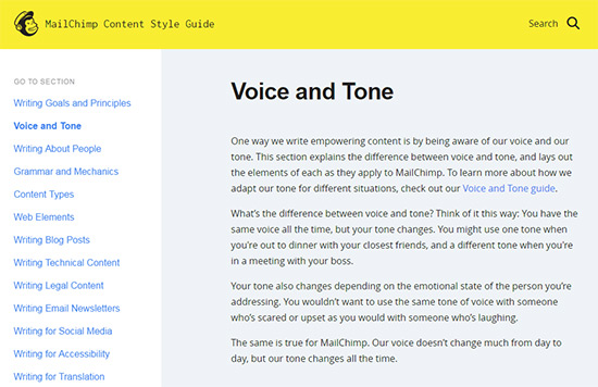
Visuals are obviously needed for all visual aspects of a website. But most websites are made up of written content. This is why some style guides include sections on voice in writing.
I’ll admit, this isn’t a huge area to concern yourself with.
However it can make a big difference in the final product if you’re willing to put down voice guidelines for copywriters & bloggers. Especially if the site has a lot of written copy.
A fine example is the TutsPlus guide covering tone for writers. This includes people who contribute to the blog and people who create premium courses.
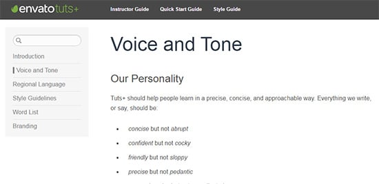
Notice these pages focus on how writers should create content. It covers very specific rules about pronouns, contractions, and addressing the reader directly.
All of these rules work specifically for TutsPlus. Writing for a different blog may require a totally different ruleset. A content-heavy website would be foolish to not include a voice section in their style guide.
You can learn just by studying live examples or reading articles on this subject. But the goal is to make a consistent theme with writing, just like how style guides aim for a consistent theme in design.
But voice & tone style guides are unique to each site. Their layout and structure will be very different, and their content will vary drastically.
Yes every site wants properly written content with no grammatical mistakes. But the tone, cadence, and technical style always vary.
Take a look over this style manual for an idea of how you could structure your guide. This isn’t really a style guide, but it does follow a similar formula to study for page design and content structure.
Parting Words
Making a great style guide is all about organizing the most useful features into the best order. From there it’s just repetition until you have all the elements added.
I hope this post can help designers working on their own web style guides. The first one you create probably won’t be awesome. But if you focus on improving the ease of use you’ll have a much easier time planning & constructing valuable style guides.