Illustrator Tutorial: How to Create a Folder Icon
This page may contain links from our sponsors. Here’s how we make money.
In today’s tutorial, we’re going to take an in-depth look behind the process of creating a folder icon, and see how easy it is to build one from scratch using nothing more than a couple of basic geometric shapes, which we’re going to adjust here and there. So, assuming you already have Illustrator up and running, let’s jump straight into it!
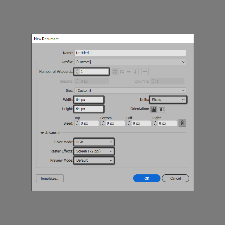
1. Set Up a New Project File
As with any new project, we’re going to kick things off by setting up a New Document, by heading over to File > New (or by using the Control-N keyboard shortcut), which we will adjust as follows:
- Number of Artboards: 1
- Width: 64 px
- Height: 64 px
- Units: Pixels
And from the Advanced tab:
- Color Mode: RGB
- Raster Effects: Screen (72ppi)
- Preview Mode: Default
2. Create the Folder Icon
As soon as we’ve finished setting up our new project file, we can zoom in on our little Artboard and then start working on the actual icon.
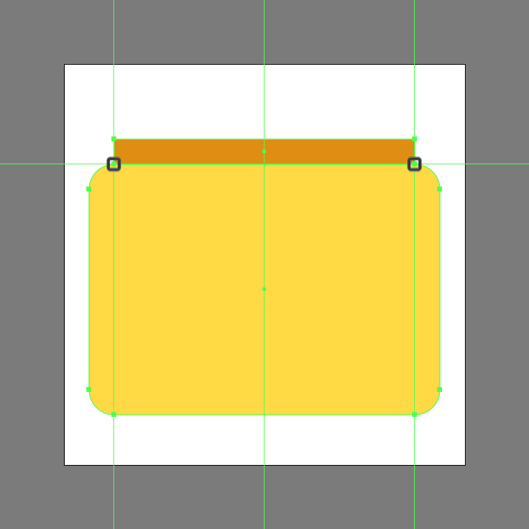
Step 1
Start by creating the front section of the folder’s body using a 56 x 40 px rounded rectangle with a 4 px Corner Radius, which we will color using #FFDB43 and then horizontally center align to the underlying Artboard, making sure to position it at a distance of 8 px from its bottom edge.

Step 2
Add the main shape for the rear section using a 48 x 4 px rectangle, which we will color using #E08E0B and then position on top of the larger shape, making sure their inner-facing anchor points overlap.
Step 3
Create the little tab using a 24 x 4 px rectangle(#E08E0B), which we will position on top of the previous shape’s top-right corner. Once you have the shape in place, open up the Pathfinder panel and then unite the two into a single larger shape using its Unite Shape Mode.
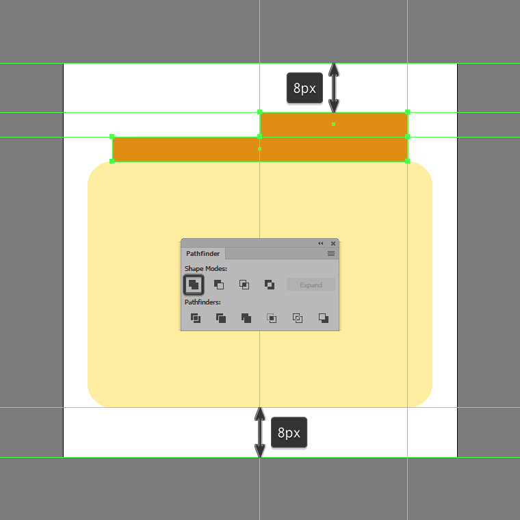
Step 4
Adjust the resulting shape, by individually selecting its lower-left and top-right anchor points using the Direct Selection Tool (A) and then setting their Radius to 4 px using the Live Corners input box. Take your time, and once you’re done, move on to the next step.

Step 5
Add the subtle highlight by creating two copies (Control-C) of the front section’s main body, which we will paste in front (Control-F twice), making sure to push the top one to the bottom by a distance of 2 px using the directional arrow keys. Once you have the shape in place, cut it out from the underlying copy, by opening up the Pathfinder panel, and then using its Minus Front Shape Mode.

Step 6
Quickly adjust the resulting shape, by changing its color to #FFE98F.

Step 7
Start working on the two detail lines, by creating the top one using a 16 px wide 4 px thick Stroke (#E08E0B) with a Round Cap, which we will center align to the front section’s larger body, positioning it at a distance of 14 px from its top edge.
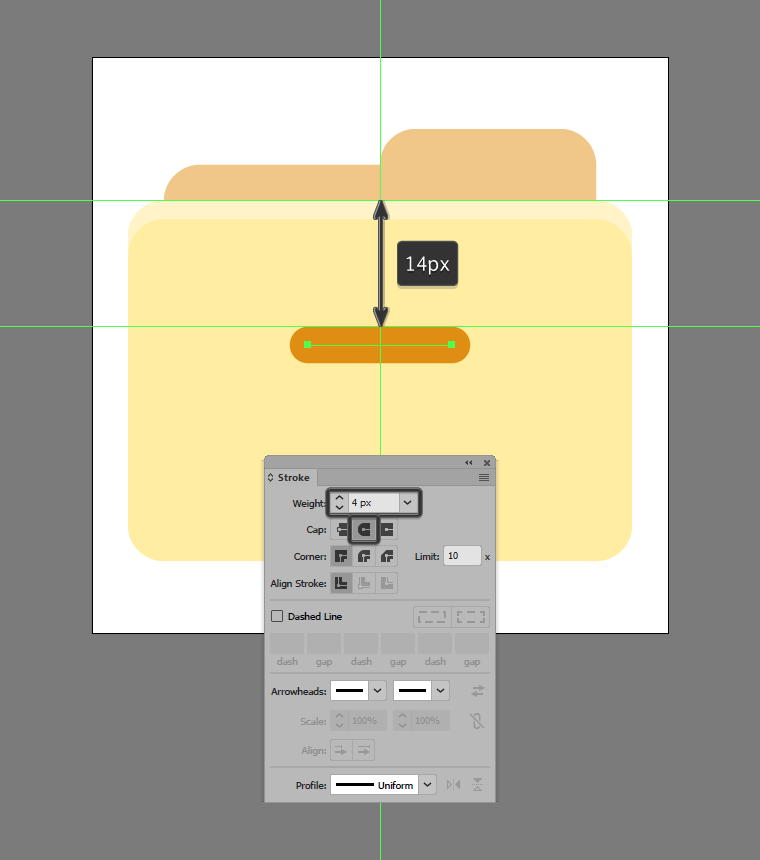
Step 8
Finish off the icon and with it the project itself, by adding the second detail line using a copy (Control-C > Control-F) of the one that we’ve just created, which we will stack underneath at a distance of just 4 px. Once you’re done, select and group the two lines together using the Control-G keyboard shortcut, doing the same for the entire icon afterwards.
Great Job!
As always, I can only hope you had fun working on the project, and most importantly managed to learn something new and useful during the process. That being said, if you have any questions feel free to post them within the comments section, and I’ll get back to you as soon as I can!
