Designing a Usable Table of Contents for Your Website: Trends & Examples
This page may contain links from our sponsors. Here’s how we make money.
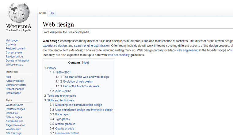
With super large pages or complex websites it helps to add a table of contents. But a ToC on the web operates differently than in a book or magazine.
The goal is to link the table sections internally to pages in your website or inside a single post. This way visitors can jump around quickly to whatever they’re most interested in reading.
But how do you design a usable table of contents that captures all your content? I’ll share a few tips and examples to get you started and help you design your own tables that users will love.
For designing ToC for your own site, you have to work in great collaboration with the your web designer so that the users have the best experience. For covering large databases or educational content, it is necessary to design a ToC that suits the user experience in best way possible. Along with the other aspects, the position of ToC is very important so as it is visible easily all across the web page. The ToC can serve the SEO purposes if designed to enhance the user experience. They make the reach of users to old posts easier and old posts are easy discovered by the new visitors. Table of contents are important for the websites featuring digital products, official records, news, important information or to display variety of products. You would have seen ToCs commonly in softwares such as Win Rar or windows explorer or video games. These may prove to be more useful than similar features such as related posts etc. The Google search engine favors such features for greater search rankings or similar SEO purposes and they also prefer it before enabling the monetization of the site. Features such as table of contents must be attractive so that the users prefer to explore through such extensive features. Table of contents are also referred to as quick links in the world of blogging and you may provide quick links for each specific category. Google staff or owner of the site may be unsatisfied with the user experience or browsing ability of the user so table of contents is an excellent feature to use.
Sticky & Accessible ToCs
If your layout is large enough I recommend using a sticky ToC or something that’s easily accessible from everywhere on the page. This works best for single-page ToCs where the links jump between different sections of the same page.
Take for example this Ahrefs post where the sidebar includes a “quick links” section.

This stays with you the whole ride down the page and you can click any link to jump to that section. Granted this post is a bit smaller so it’s not as detailed, but those links still help a lot.
And this goes double for sites with multi-tiered nav links that might confuse unsuspecting visitors.
Take for example the docs page on the PokeAPI site. Documentation is notoriously detailed so this ToC really makes browsing a cinch.

I know that not every page has room to keep something like this fixed in the sidebar. So if your layout really can’t accommodate a fixed table then don’t try to cram it in.
But think about usability when designing your table and try to make it accessible for everyone. This includes responsive layouts where the screen might be super small on a smartphone device.
If your links are clickable and they actually work then the user will be happy enough.
Smooth Scrolling Links
I always prefer smooth-scrolling effects over the harsh jumps that you find in most tables. Again this pertains specifically to single-page ToCs where the user is jumping around to different sections on the page.
These all work the same way by using anchor jumps with a hash sign. For example, an anchor with href=”#stuff” would jump to the page element with the name or ID attribute of “stuff”.
But with a little JavaScript you can add smooth scrolling to these links. Take a look at the smooth scrolling effect on Full Home Living whenever you click any of those ToC links.

They scroll down directly to the page header with a quick animation effect, but it’s not too quick or harsh like a page jump.
If you define the JS(Java Script) offset a little higher than the page element you can leave some room for a fixed navigation too. This technique works great on desktops and smartphones so it’s a responsive-friendly scroll feature you can port anywhere.

Also take a peek at some of the review pieces on Android Authority to see a similar style.
This fixed ToC follows the same accessible trend I mentioned before, plus it has a very smooth scrolling animation. Their ToC’s are littered with headlines so they’re pretty dense and genuinely valuable to readers.
Keep this smooth scrolling feature in mind while designing your ToC. It might be something you add towards the end of your project but it’s well worth adding for a more user-friendly design.
Multiple Sub-Levels
Most dense pages run with headers and sub headers. If you have tiered headings on your page then try adding subheadings into your table of contents.
You can break down subheadings into any style you like. But the best approach is to make the text smaller and even thinner if you can.
Visual hierarchy is crucial to a usable interface. If you can showcase your ToC(Table of Contents) with a clear hierarchy it’ll be easier for visitors to browse through and skim to find the links they want.
You can find another great example of subheadings in the Laravel Docs. Note these actually load different pages so you aren’t scrolling through one huge page.

But the sidebar operates with main “headings” along with subpages underneath. Text styles are totally different but you can still easily browse through and find exactly what you’re looking for.
Try to be judicious with subheadings and don’t overload your readers with too many options.
A well-organized table of contents is always a great idea. Just try to strike a balance between organized and overly detailed.
Design For Quick Browsing
You’ve probably seen multi-part articles or detailed pages with huge tables organizing each section. These help you jump to the part you need and start consuming content fast.
Craft your ToC(Table of Contents) for easy browsing and create a structure that makes sense. You don’t actually need a table element, since really these ToCs act like list elements with a long list of accessible links.
Take for example this ToC page from David Bushell.

This acts like a massive guide to his entire website. You can browse through his past projects, some of his best blog posts, and information about what he does.
You might consider this page like a ToC(Table of Contents) that you’d find a book. However the book is David’s website packed with tons of information across dozens of pages.
Shay Howe offers something very similar on his HTML/CSS learning guide which links to different tutorials and topics in the guide.

Again this is a strong example of a full page ToC(Table of Contents) where the user can feel comfortable browsing between pages. The above examples are good choice to just grasp a idea of what table of contents may look like. At the end, there is no limit to creativity and you can customize these features to every extent possible. TOCs are not different than menus and sub-menus that operate in different web designs.
Plus the lessons are organized neatly into the sidebar displayed on every page so this follows my tip on accessibility too. Go figure!
Moving Forward
Before you launch a table of contents for your site make sure it actually serves a purpose. You don’t want a ToC to be annoying, but rather something that encourages interactivity. You just do not need to create table of contents just to fill up the excessive space but it must be helpful to all the existing and new users paying visit to your website. If you get creative enough, then you may guide the designer properly regarding each and every aspect of ToC that suits your site. There is no limit to as of how much creative you can get so give it a best shot. While redesigning a site, you may consider updating your table of contents and ensure that it does not look to be old-fashioned. As an owner of the site or freelancer, you are setting new trends in the world of designing and you are not less than an inspiration for the future designers. If your ad sense account is not getting approved for the site, you may consider adding a suitable table of contents so that the users get precise about what they want from your site. Some designers consider TOCs as an old-fashioned feature. Anhow, it depends upon the creative intellect of the designer that how he presents the old-fashioned feature in a modern way.
Still I hope these tips can get you moving in the right direction and hopefully my examples in this post can get you started with some design ideas.
Now if you’re looking for more tips on building a table of contents for the web I recommend these free tutorials & resources: