How to: Make a Hand-Drawn Font
This page may contain links from our sponsors. Here’s how we make money.
Before I start, let me say that this is by no means the only way to make a hand-drawn font. Ever since I began giving away fonts, I've had many requests for me to write a tutorial on my font-making process, so here it is. This is how I do it, and depending on your responses, I can go deeper into a FontLab Studio tutorial. This tutorial, however, is designed to reveal my process from start to finish. A lot of you may not have FontLab Studio, so you may need to adapt the second half of the tutorial to whatever font software you may have access to. Hand-drawn fonts are always in demand as they are of more quality and represent the hard work put in by the designer. Hand-drawn fonts and other styles are given priority than other computerized fonts. Some people think that hand-drawn fonts require a lot of perfection and practice. It is not like that. Here we go.
How to Make a Hand-Drawn Font
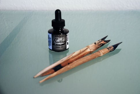
1. The Tools
I like to use India Ink and primitive Bamboo Pens (above) to draw my characters, but you can even just use a pencil and paper if you like. You can get both the items pictured above really cheap (< $10 total) from your local art supply store or Hobby Lobby, etc.
2. Start Drawing
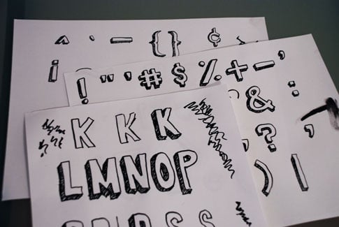
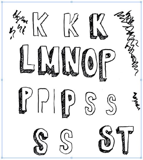
Take whatever tools you choose to use and start cranking out letterforms. It's ok to mess up, just draw the letter again. But keep cranking them out until you're happy with what you've got. I like to lay all of the finished ones out in front of me so I can see what I already have and what I still need. The squiggly lines are just where I got rid of some excess ink from the tip of the bamboo pen before sketching.
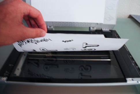
3. Scan
Next, I scan the images in at a relatively high resolution.
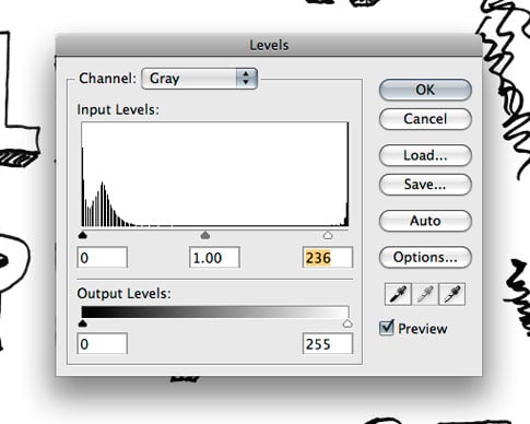
4. Bump up the Contrast
In order to get a better final result, I adjust the contrast of the scan. I typically convert my image to grayscale, then use Levels (Control/Command + L) to make the whites whiter and the blacks blacker. Then save as a high-res jpeg.
5. Open the Scans in Illustrator
I use an “outline font editor” (FontLab Studio) which is another way to say that the final product needs to be a vector. I use Illustrator's Live Trace to vectorize the shapes. So next, I open the jpeg scans in Illustrator.
6. Live Trace
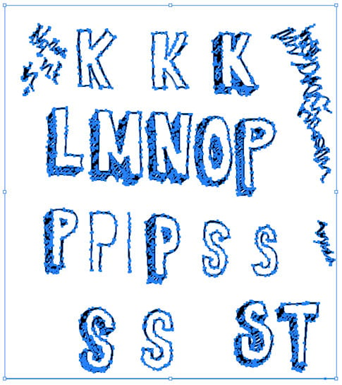
Vectorize your image using Live Trace to get the results your happy with, then hit “Expand.” So now you have something like below.
7. Ungroup
After you Live Trace, ungroup the objects.

8. Get Rid of the White Shapes
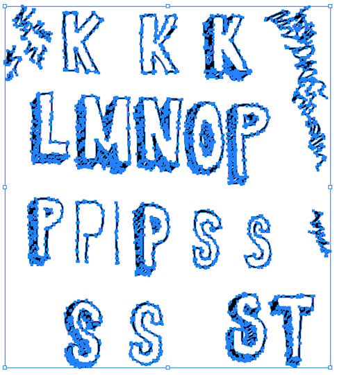
After ungrouping, I use the Magic Wand tool and click on any of the white space in and around the letters. This selects all of the white shapes at the same time, and then I delete them.

So now all that remains is the black shapes. Notice the bounding box. There is no more whitespace around the edges compared to just after live trace above.
9. Prepare the Font Editor
It's now time to fire up the font editor of your choice. I use FontLab Studio ($649) but it's not the only one. TypeTool is a $47.99 Font Editor from the same people who make FontLab Studio. If you're not looking for anything fancy, that's the one I recommend (Windows, Mac), and it's affordable compared to other products on the market. FontForge is a freeware font editor if you want to explore that option.
Depending on which editor you plan on using, the next part might be a little different than your software, but you can get a general idea, and adjust accordingly. If you use TypeTool, it should be very similar, since the software I use is from the same company.
Create a new blank font file.

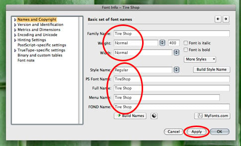
Go to File > Font Info.

Fill out the information that describes your font. Family Name, Weight, Bold or not, etc. This information is important and will be embedded in the file in its final form.
10. Copy/Paste
Start copying/pasting your characters (paths) one-by-one from Illustrator into their corresponding slots in your font editor.

11. Adjust
Adjust Each character's paths to your liking in the font editor. You can always go back and make adjustments if you don't get it right the first time. And again, I can't go too deep into this if you aren't using FontLab Studio, but I'm sure you can find some info in your software's help section or google 🙂
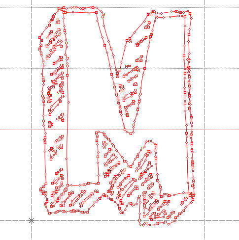
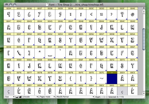
Here's a peek at what one of my completed fonts looks like in the font editor.
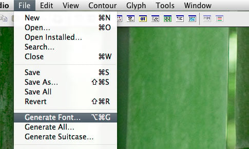
12. Generate Your Font
Go to File > Generate Font…
Choose your format (.ttf will work fine for both Mac and PC) and Save!

Done!
As I said, this isn't the only way to do this, it's just the way I happen to do it. After calibrating fonts on paper, you have to do some post-production work so as to make your font look like perfect. Creating original fonts and content is a lot more fun than using fonts from other sources. You should practice creating a variety of hand-drawn fonts and using them in your own work. You can draw your letters with the pencil tool directly in Illustrator if you feel like it. The whole process of creating hand-drawn fonts is similar to craving on the stones and other ancient techniques of writing. If you are investing your energy into it, I bet that you will reap rewards very soon. There are many different ways, I just wanted to share my process with everyone, since you've been wondering. I hope you enjoyed the tutorial 🙂
