Unique Web Fonts to Spice Up your Layout Designs
This page may contain links from our sponsors. Here’s how we make money.
It goes without question that CSS3 has been a major improvement on how we build websites. Beyond the additional properties I've found CSS3 web fonts to be a groundbreaking addition to the developer's tool belt. You can import external fonts or even include your own custom-made fonts with just a few lines of code.
But not every website needs to include 5 or 6 additional typefaces. There is a rhythm to choosing great fonts which can help you avoid building websites that look like a 10 year old's first time in Microsoft Word. I'd like to share a few tips for selecting fonts and how you should apply them with grace and humility.
Matching for Context
The first thing to keep in mind is that not every font will work as a heading, nav menu, paragraph, or blockquote. Readers expect a limited range of fonts used as paragraphs because they're easy to skim when bunched up into blocks. This same ideology applies to headers because the fonts look good at larger sizes and they're easy to distinguish.
One of the best ways to find new fonts is by looking through existing websites. Many will use premium services or even host fonts locally – but these aren't the only choices. For each premium font out there you can find plenty of existing free fonts which look very similar. Compile a list of your favorites and keep this handy when building new websites.
It's easier to learn from others but the quickest way is to make the mistakes yourself. Run a couple different fonts live on your website and switch between them on alternating weeks. You can check traffic analytics to compare page retention time and gauge which fonts may be easier for visitors to read. A lot comes down to psychology because if your paragraph font even looks convoluted then it might scare away readers after the first couple of words.

Sometimes the best solution is the simplest one. As I mentioned you don't need 4 or 5 different fonts running on each website. Just 1 or 2 different families for header text is often enough. Traditional choices like Arial or Helvetica work for paragraphs because everyone is already familiar with those styles.
Online Web Fonts
One of the best solutions would be hosting a font family externally from another website. This is common when using a service like Google Fonts, although I should note that you can download copies of most files if needed. External hosting is typically easier because Google's CDN can probably handle more traffic and load quicker than your server. It can be a risk to rely on an external service even when they are as trustworthy as Google.
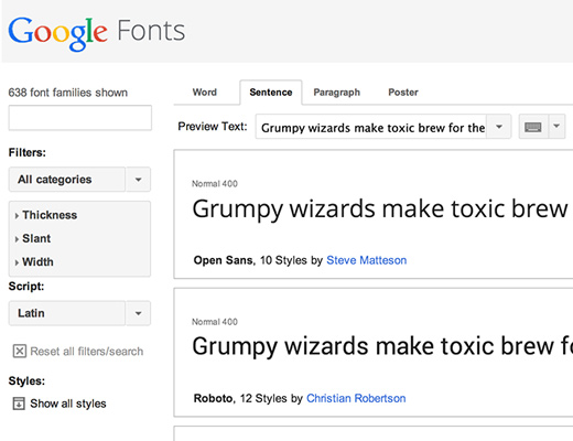
But I've found Google Web Fonts to be nothing but exceptionally uplifting. This is especially true with smaller projects where you can just toy around and see what works. This way you don't need to really commit with extra font files hosted locally.
Another possible service with a broader font selection is Typekit. This is actually a premium service owned by Adobe which organizes work from type foundries and individuals around the world. It's a yearly subscription so if you do a lot of design work I'd highly recommend checking out what they have to offer.
Typekit is similar to Google in that you can download desktop fonts and use them within programs like Adobe Photoshop or Illustrator. It is a brilliant choice for designing websites or mobile apps with unique typography to help them stand out from the competition.
Icon Fonts
Icon-based web fonts have skyrocketed into popularity amongst designers. These fonts may be compared to the 10 year old in MS Word playing with his Wingdings characters. But now you can work with web-based icons built into a font and customize the size, color, and location with CSS.
Even the popular Bootstrap framework includes some free icons that you can use. Designers will create these fonts and release them for free on Github and other websites. Then developers can work with these icons in many different projects to create a seamless interface.
My new favorite set is Captain Icon designed by Mario del Valle. It's got a nice hand-drawn style that not many icon fonts have. Also did I mention it's completely free? Definitely can't argue with that price tag.
You might also try free icon sets like Entypo, Font Awesome, or Fontello. There are dozens of choices out there you merely need to know where to look. But if you need similarly-designed icons in your website please try out at least one icon web font. They're scalable and easy to update with a bit of HTML and CSS.
Finding a Balance
One final thing to consider is striking a clean balance with your typefaces. I would recommend never going above 5 different fonts on a single page. This leads down a slippery slope to chaotic content where it's difficult to distinguish between sections on the page.
You should also try to match with similar serif or sans-serif typefaces. Headings are an exception where you could try to mix the two – but it can be difficult to pull off successfully. Again I'd recommend looking over your favorite websites to see what kind of fonts they have. You can learn a lot by studying from other designers who know a thing or two about typefaces.
If you have similar ideas feel free to share with us in the comments area. Web fonts have greatly expanded the possibilities of web design and it's encouraging to see the multitude of free open source solutions. Just be sure to use them properly and sparingly.