32 Inspiring Websites With Borders
This page may contain links from our sponsors. Here’s how we make money.
In the age of responsive web design, where websites are able to expand to the infinite widths of your browser window, it's sometimes hard to know where your computer screen ends, and the real world begins (Not really — but for the sake of this post, please bare with my exaggerations.) Ever since the popularity of full screen, responsive design took hold, I've noticed an increasing trend in the addition of borders to websites. While borders on websites offer an elegant design aesthetic, they also provide a needed sense of space, and help to establish boundaries, within the the boundry-less world of responsive design. Borders are used to determine the size of the page layout and make sure that all the content appears to be perfectly fit in all sort of devices.
Websites With Borders
1. Givenchy.com

The menu may surround the web page even when you scroll down the page.
2. SewSewShoppe.com
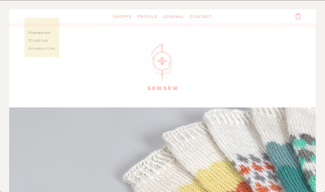
Every kind of clip art can be used to surround the web page.
3. MauMorgo.com

You may surround any specific side of the web page with social media buttons or any other such menu so as to make sure you fulfill your purpose through your site.
4. TomaszBiskup.com
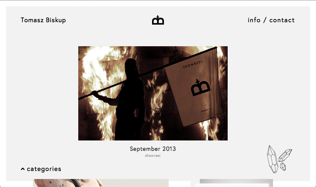
The border should be inserted in a way that it appears to be in correct way in all the available screens and formats.
5. SangHan.co

One may surround his web page with specific buttons that carry them to the different sections of the site.
6. ArsCampusIl.com

The border must be in some sort of contrast with the text included in the content of the web page.
7. PpFestival.gr
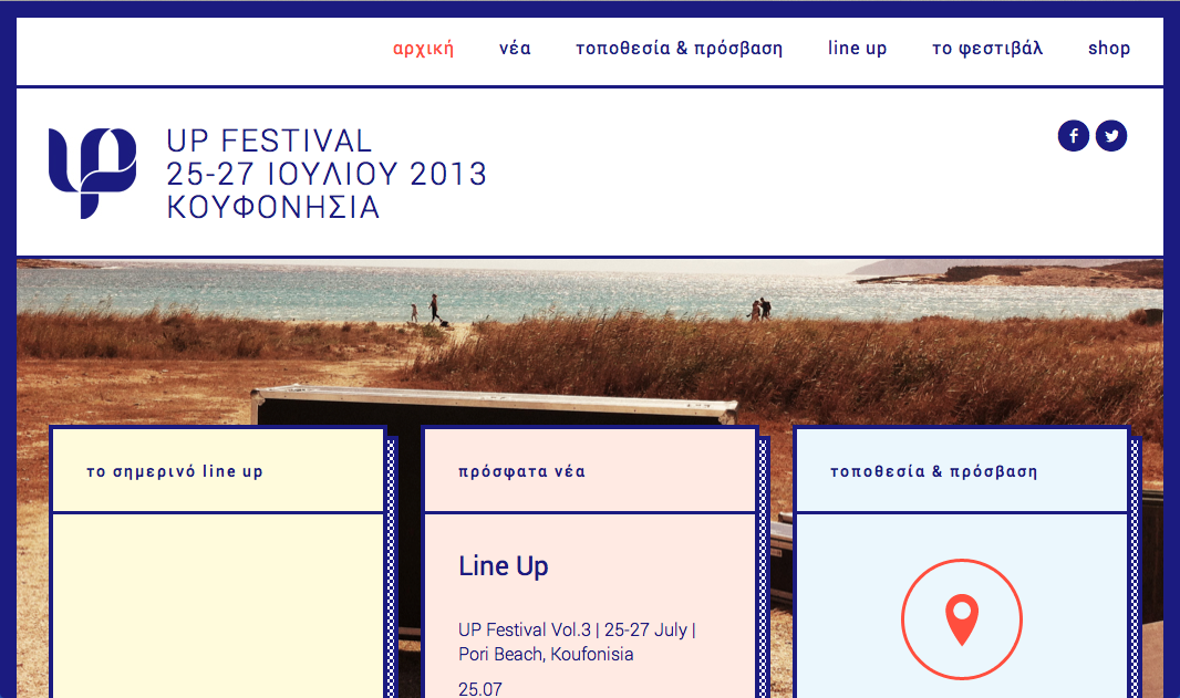
The borders should be continuous, sharp, clear and it may be just white line making the whole page to fit the screen.
8. SocketStudios.com

As regards to the display resolution of the site, the border must be aligned throughout the page and it should be made sure that it does not affect the functionality of the site.
9. ConvoyInteractive.com
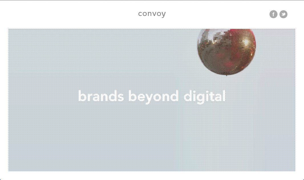
The border may not be well-defined but it may fulfill the purpose of keeping the whole web page in shape.
10. Moma.org

The websites for presentation that serve educational purposes may be designed with well-defined borders containing all the proper tools to perform all kinds of functions.
11. Somosende.com

Keeping all the possible resolutions and other aspects of the web page into consideration, the text field must be limited to the specific area.
12. ElectricBodies.com
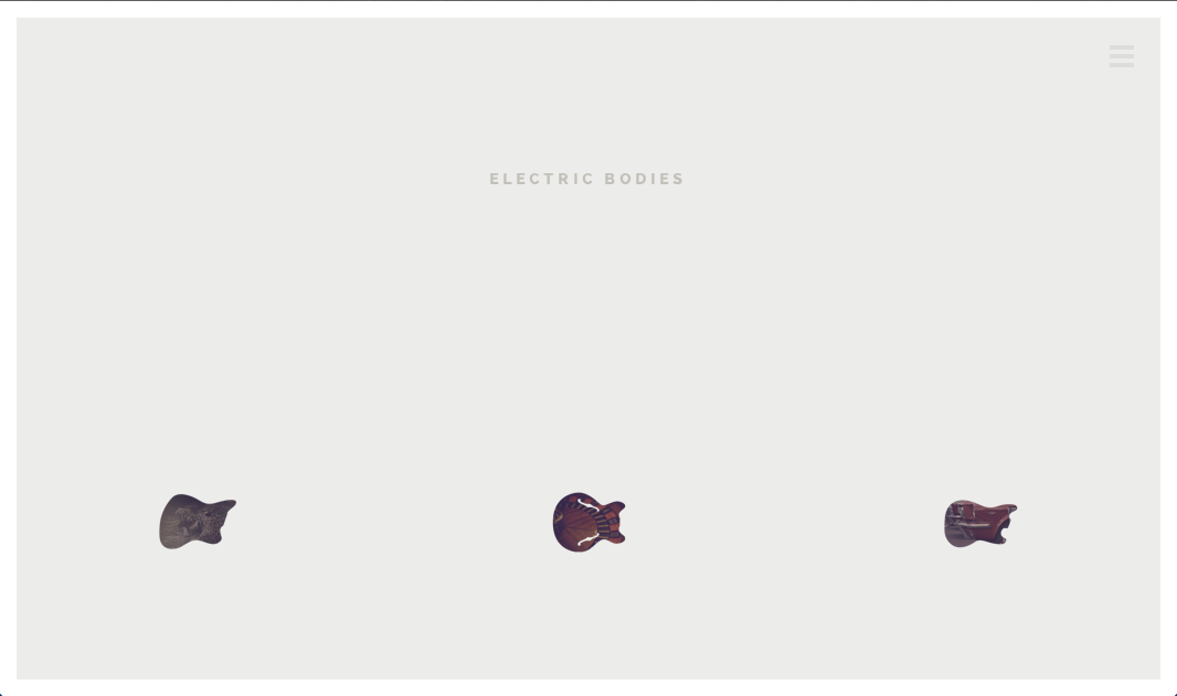
The border may contain small-sized floating images, selections or any other sort of graphics to support the site.
13. LaMoradaDeLosAndes.com
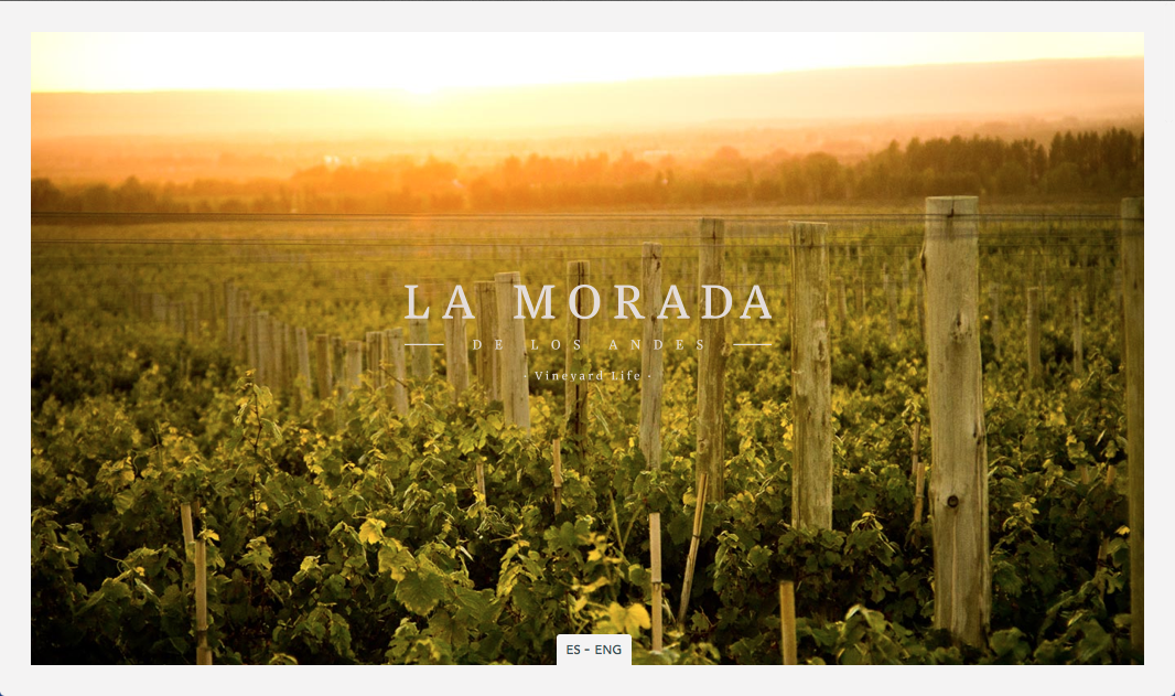
Sometimes it may become troublesome for the designers to display full-sized images across the whole page so they may make use of borders to define the content in proper context.
14. RunTheGap.com

The borders may be created within the content to separate the sections and the edges of the web layout appear to be sharp.
15. KokoroMoi.com

There must be enough space between the scroll bar and the content so that the user enjoys scrolling the site without loosing visibility in any format.
16. OakDesignStudio.com
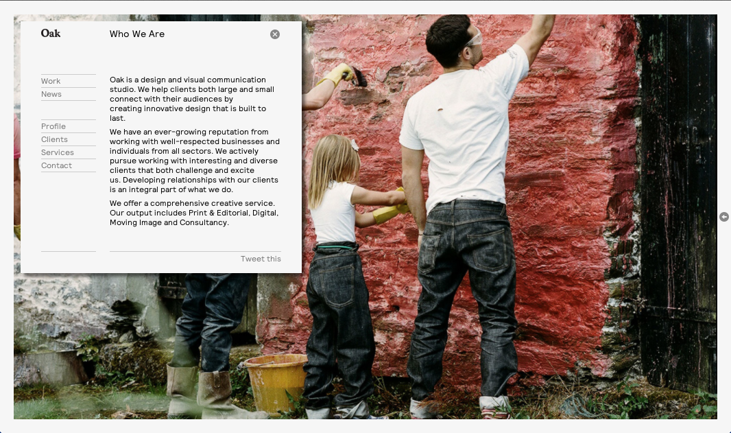
The functionality and graphics of the site are limited to the specific area. This makes it easier for the web page to function properly on each and every format.
17. Opero.gr
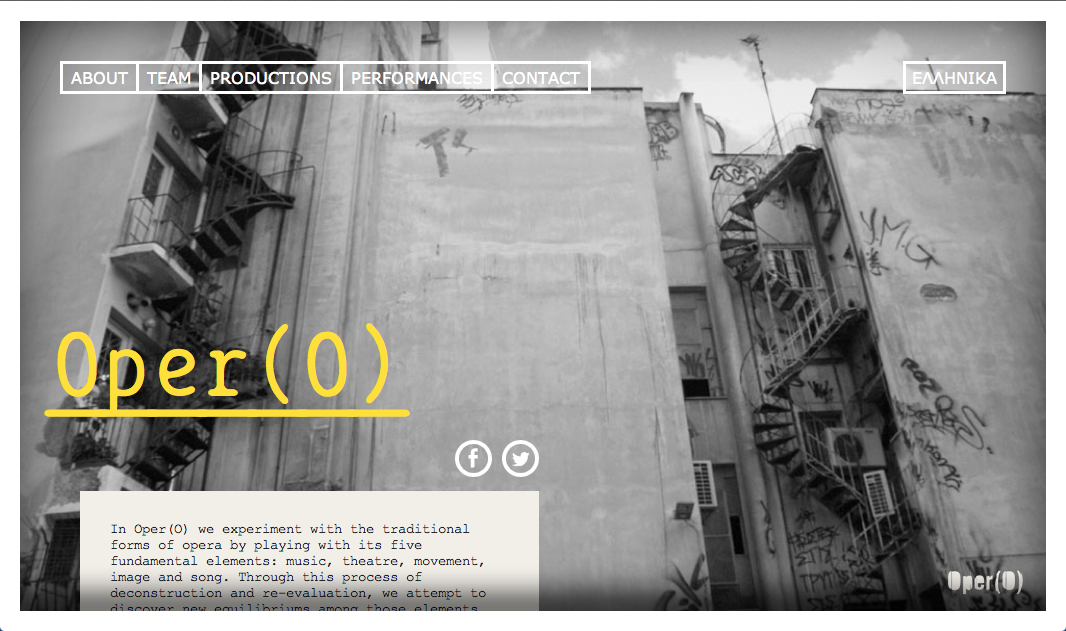
You may color the border with colors similar to the original content thus creating a contrast between border and the content of the site.
18. Make-Matter.com

The border may appear to the background of the whole web page thus giving a nice and unique look.
19. JensLehmann.com
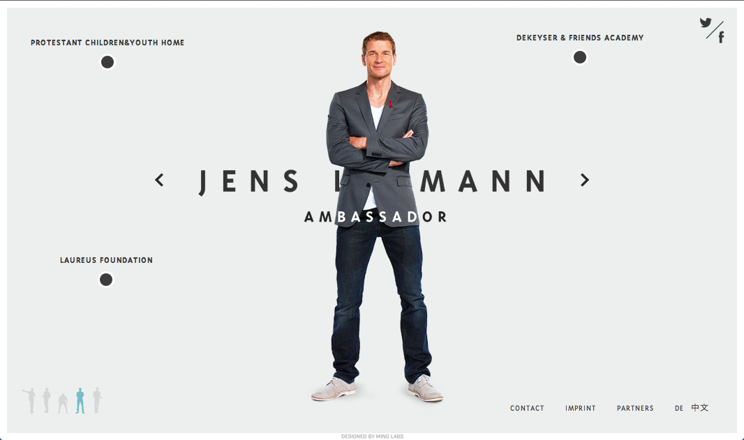
The border of the site may be a slide bar indicating the number of pages you have gone through. It can be a similar tool related to the site providing more information related to the site.
20. DiscoverShadow.com

The dark border over the white surface makes it a lot clearer and beautiful.
21. ADABlackJackGoods.com

22. FitzFitzPatrick.com

23. Heliom.ca

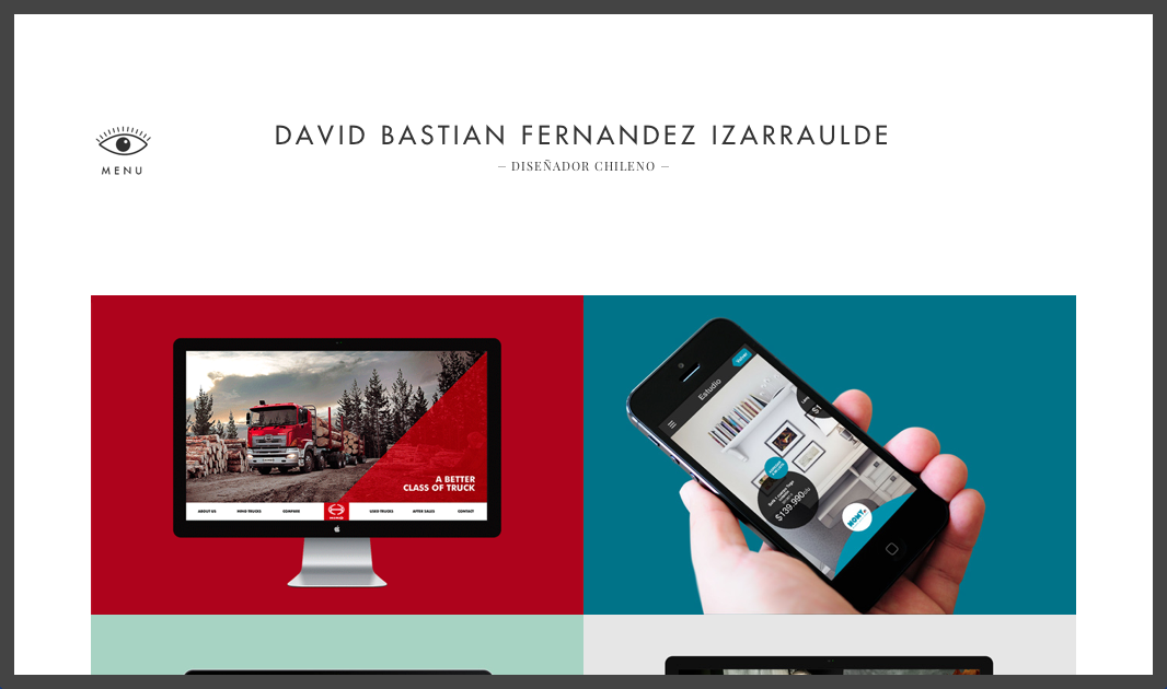
24. DavidBastian.cl
25. LaunchPad.la

26. AurelienJuner.com

27. NarrowDesign.com
28. JustSmith.com

29. LaMondaMagazine.com

30. McLellanJacobs.com

31. AndiMayr.de