30 Flat Analytics Dashboard Charts & Graphs for Website UI Design
This page may contain links from our sponsors. Here’s how we make money.
Online dashboards like Google Analytics are some of the most advanced modern web applications to date. They pull data related to stats, sales numbers, or conversion rates and display this information in sortable charts. Each dashboard has a set of personal needs which can be met through expertise in web design.
The following examples are perfect for any web designer currently working on a dashboard interface. Some designers may choose to create a dashboard merely for practice while others could be working on a real-world client project. Either way this gallery is perfect for anyone who’s looking for inspiration for an aesthetically-pleasing and usable dashboard.
Flat Analytics Dashboard Charts & Graphs
Nettgrap

The multiple sidebars create it interesting and easy to display bulk of information through graphics.
Knowledge Dash

Another great user interface to get deeper insight into the consequences over different periods of time.
Server Info

The single information has been displayed in different formats and metrics so that the user can analyze the metrics in a better way.
Mango CMS

One is curious to know the details of progress so such interface is suitable to contain curiosity of the user.
Recipe Dashboard

This interface is suitable for the people who want to analyze things with their own perspective of liking and disliking.
Pinxter

The most common ways of representing things have been combined to provide better guidance and do not get fooled by the single perspective.
Paymetrics

The graph representation for each metric is available separately so that one can compare all the metrics easily.
Achoo UI

Similar to the other dashboards but with good colors and representation.
Analytics App UI

Some interfaces allow you to analyze things with proper reference, sequence and specific categories of interest and focus.
Formstack

The important information has been displayed prominently while past details are also listed on the same page.
Sample Dashboard

The metrics can be displayed in tabular as well as graphical form so that users can deduce an appropriate results from overall analysis.
Preview Dash

Colorful graphs are used to depict the particular results according to different range of colors.
Campaign

All the metrics and graphs are properly organized and orientated so that the user can grasp quick information over short periods of time.
Keyword Search

Neat and clean interface to display the information that is bit complicated to understand.
Sceatt.co

The perfect earning to record and display earnings or sales over different periods of time.
Analytics(Final)

Similar to google analytics or ad sense but with better colors and interface quality.
Automation App

You can customize this interface according to your own purpose to indicate large details of a particular system.
Tradernet

Analysis involves studying all the aspects of a particular condition or study material.
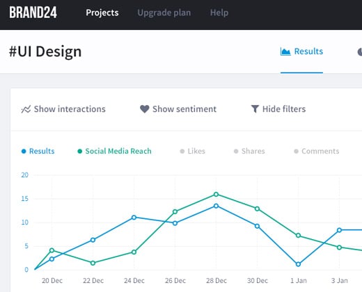
Brand24

This interface includes filter so that one may analyse considering the only few aspects. There are many categories and sections available to categorize the bulk of results and deductions.
Flat Blue Dash

There are variety of ways to display and analyze particular results but keep it sure that the interface appears to be clean and smooth.
Monarch UI

There are variety of tactics and ways to depict a particular analysis and those tactics have been listed in the sidebar.
LPCloud

Each of the metric has been displayed and highlighted prominently so as to provide clear insight to the user.
Flat White Dash

These dashboards are necessary to analyze the performance of a particular online business or any other business.
Doha Forums

The logo may be displayed along each particular metric to make it look more interesting and appealing.
Dark Dashboard

These dashboards are available to inspire you thoroughly and give little spark to your creativity.
Shopping System

Another great inspiration for users who have no idea where to start or how the things are displayed on web.
Colorful Dash

The user can replace particular section or metric with another one according to his own preferences.
University

The user may create a new lead so as to analyse a particular metric of his own choice.
Admin Panel

All the information has been oriented in detail and the user will crave to look at it again and again for such a detailed analysis.
Pastel Dash

The user may guide the designer to design dashboard of his own choice and preferences so as to deduce results in a perfect manner.
