Illustrator Tutorial: How to Create a Simple Computer Icon
This page may contain links from our sponsors. Here’s how we make money.
In today’s tutorial, we're going to take a close look behind the process of creating a simple computer icon, and see how easy it is to build one of our one using nothing more than some basic geometric shapes.
1. Set Up a New Project File
As with any new project, we’re going to kick things off by setting up a New Document, by heading over to File > New (or by using the Control-N keyboard shortcut), which we will adjust as follows:
- Number of Artboards: 1
- Width: 96 px
- Height: 96 px
- Units: Pixels
And from the Advanced tab:
- Color Mode: RGB
- Raster Effects: Screen (72ppi)
- Preview Mode: Default

2. Create the Background
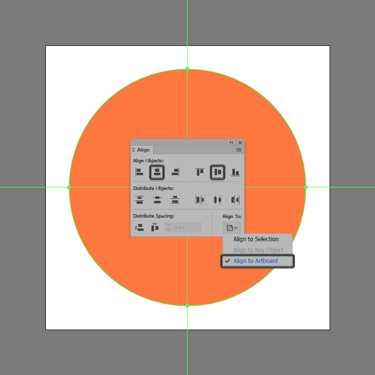
Once we’ve set up our project file, we can start working on the actual icon by creating its background. To do so, select the Ellipse Tool (L), and use it to create an 80 x 80 px circle, which we will color using #FF793E and then center align to the larger underlying using the Align panel’s Horizontal and Vertical Align Center options.
3. Create the All-In-One Computer
As soon as we have our background shape in place, we can start working on the actual computer, so let’s jump straight into it!
Step 1
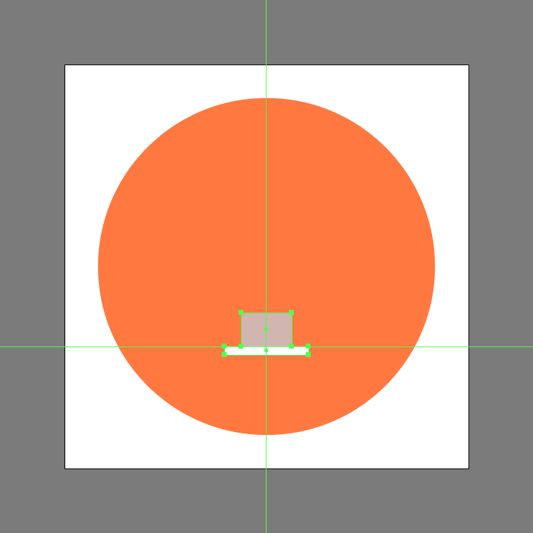
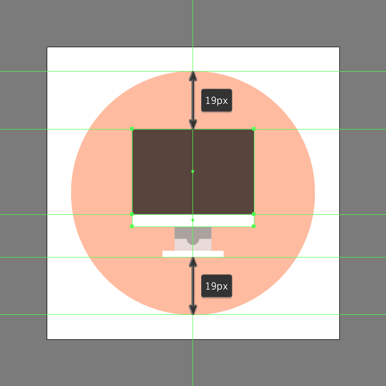
Start by creating the main shape for the stand’s base using a 20 x 2 px rectangle, which we will color using white (#FFFFFF) and then center align to the larger underlying shape, positioning it at a distance of 19 px from its bottom anchor point.

Step 2
Add the vertical section of the stand using a 12 x 8 px rectangle, which we will color using #D1B7B2 and then position to the center of the previous one’s top edge.
Step 3
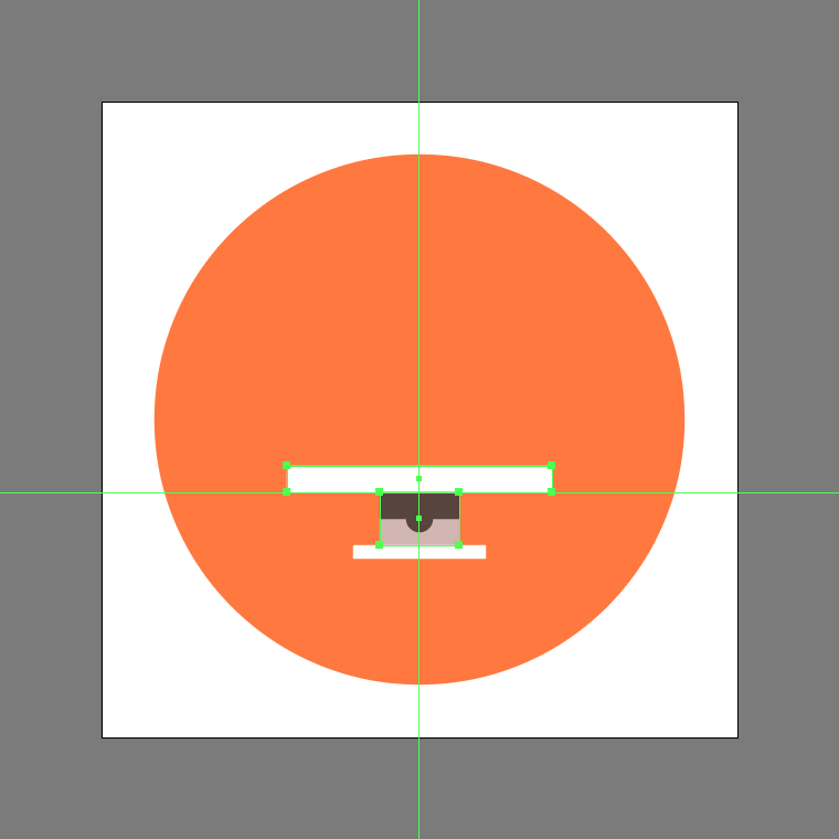
Create the hard shadow using a 12 x 4 px rectangle, which we will color using #56423B and then center align to the vertical section’s top edge.

Step 4
Add the circular cutout using a 4 x 4 px circle (#56423B), which we will center align to the stand’s vertical section. Once you’re done, select and group all of the stand’s composing shapes together using the Control-G keyboard shortcut.

Step 5
Start working on the computer’s lower body using a 40 x 4 px rectangle, which we will color using white (#FFFFFF), and then position on top of the stand.
Step 6
Add the screen using a 40 x 28 px rectangle, which we will color using #56423B and then center align to the previous section’s top edge.
Step 7
Create the main shape for the screen highlight using a smaller 36 x 24 px rectangle, which we will color using #7C6159 and then center align to the previous shape.

Step 8
Finish off the icon and with it the project itself, by adjusting the shape that we’ve just created by selecting its bottom-right anchor point using the Direct Selection Tool (A), and then pushing it to the left side by a distance of 24 px using the Move tool (right click > Transform > Move > Horizontal > -24 px). Once you’re done, select and group (Control-G) all of the screen’s composing shapes, doing the same for the entire device and icon afterwards.
Awesome Job!
As always, I hope you had fun working on the project, and most importantly managed to learn something new and useful during the process. That being said, if you have any questions feel free to post them within the comments section, and I’ll get back to you as soon as I can!